Vibe coding flow state
Read →
No, I haven’t gone unhinged with the bold formatting —
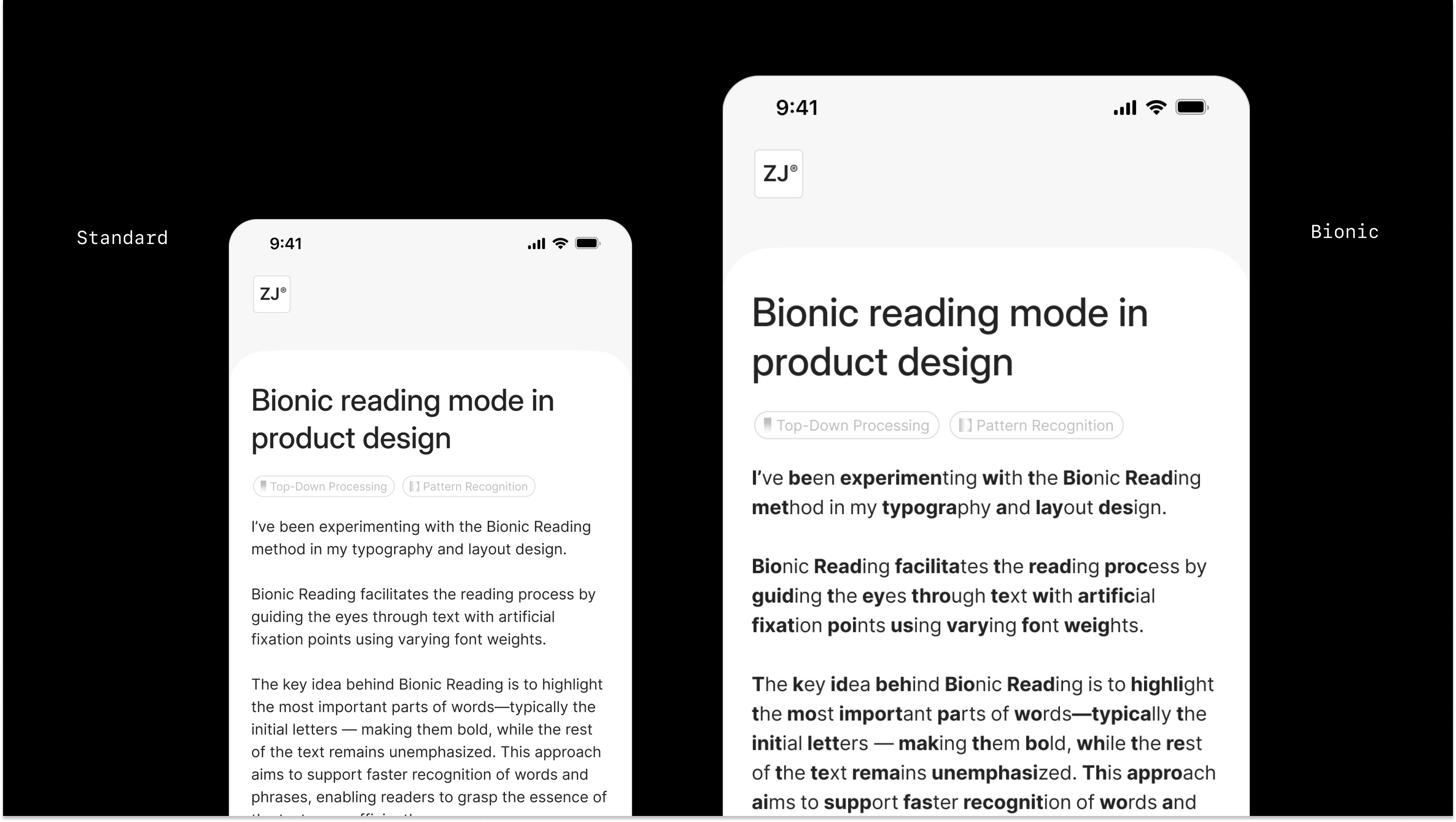
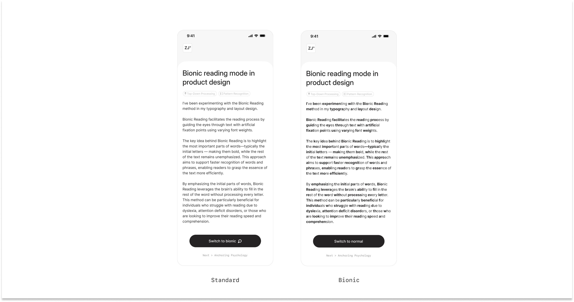
I’ve been experimenting with the Bionic Reading method in my typography and layout design.
Bionic Reading is a visual enhancement method facilitating the reading process by guiding the eyes through text with artificial fixation points using varying font weights.
The key idea behind Bionic Reading is to highlight the most important parts of words—typically the initial letters or portions of words — making them bold, while the rest of the text remains unemphasized. This approach aims to support faster recognition of words and phrases, enabling readers to grasp the essence of the text more quickly and efficiently.

By emphasizing the initial parts of words, Bionic Reading leverages the brain's ability to fill in the rest of the word without processing every letter. This method can be particularly beneficial for individuals who struggle with reading due to dyslexia, attention deficit disorders, or those who are looking to improve their reading speed and comprehension.

Want to view a quick bionic reading prototype? Here’s a link 👉🏻